Innovative Design in Genomic Insights
A rising startup company aiming to revolutionize the genomics industry for college students.
THE PROBLEM
Those with interest in learning more about their genetic makeup and what that makeup means for them spend hundreds on doctors and genetic testing each month, all while risking giving up their private information. GenomEdge aspires to deliver the power of genomics to consumers (specifically targeted for college students) in an affordable and unadulterated private manner.
THE SOLUTION
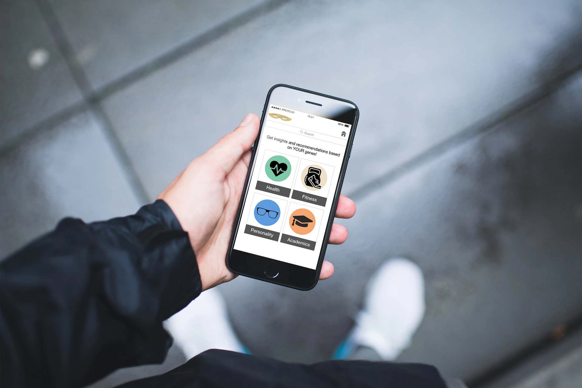
A mobile app, which offers individually tailored insights (health, fitness, personality, and academic insights) based on DNA testing, is the engine behind GenomEdge’s innovation. Clean and easy UX and UI are critical to the overall success of the app.
MY ROLE
Towards this goal, I worked alongside the team of three Berkeley MEng graduates and one genomics scientist to redesign app screens and optimize the user experience.
The Team
Amber Hicks (Me) - UX/UI Design Consultant
Arjun Bidesi - Founder & CEO
Dinkar Juyal - Product Lead
Kaushal Yagnik - Tech Lead
Zhong Wang - Genomics Scientist
TOOLS
Proto.io, Adobe Illustrator, Draw.io
Understanding the Problem
GenomEdge was working towards many goals simultaneously. The mechanics of the mobile app and the genomic testing were complete, but the company needed ideas for improving the UX and UI of the product. I consulted the CEO to distill up-front which aspects were priorities.
I found out the company already had an immediate prototype and a long-term vision prototype for the app, so these would be central to testing and improving usability and design.
Usability Analysis
I test ran the immediate prototype several times, looking specifically for inconsistencies in flows and interactions and analyzing points of confusion. I also compared the prototype against Apple’s iOS Human Interface Guidelines (HIG) to see how the app compared to best practices.
Impressions
The immediate prototype featured noticeable deference and depth, instantly highlighting the existing fluid motion and content hierarchy.
One major concern for the app was clarity. Most of the text and GUI elements broke Apple’s HIG standards. This could lead to serious implications for the company.
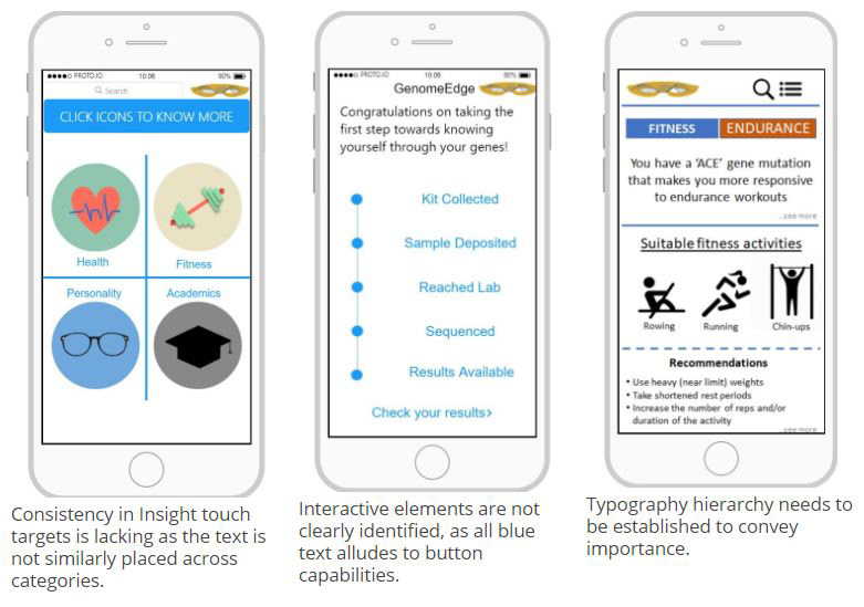
I saw potential benefits from several holistic changes - keeping button sizes and styling consistent, arranging the UI to maximize available space and create negative space, and creating contrast between text fields and controls that convey interactivity.
Focus
After a team discussion, it was determined that priority be placed upon:
User Flows
As I test ran the prototype on proto.io for the final time, I simultaneously created a user flow on draw.io to reflect the app’s current interactivity. This would help me discover commonalities, current successes, and current breaks in the flow.
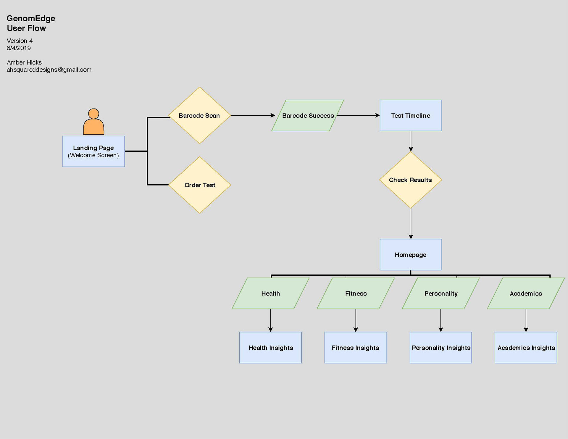
The biggest takeaway that I discovered was the lack of “emergency exits” from most screens. This breaks user control and freedom, according to Nielsen Norman’s 10 Usability Heuristics. After discussing this revelation with the CEO, we came to the conclusion that “emergency exits” needed to be established with either back buttons, a tab bar, or some sort of Home button.
Screen Iterations
The main goal of iterating existing immediate app screens was to maximize consistency and clarity. This step required the most collaboration between designing and establishing its functionality. An open line of communication was crucial in successful screen iterations.
The most challenging aspect of this step was learning the proto.io platform. I jumped right in and played around with all of the features, which helped me to overcome fears and quickly learn the ease of this web-based platform.
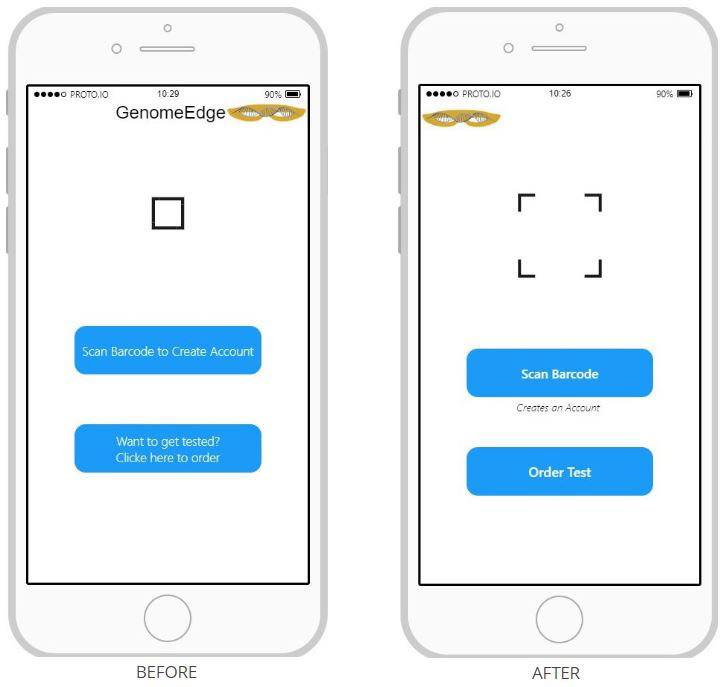
Scan Barcode Screen - Calls to Action button text reworded to increase efficiency of use and recognition
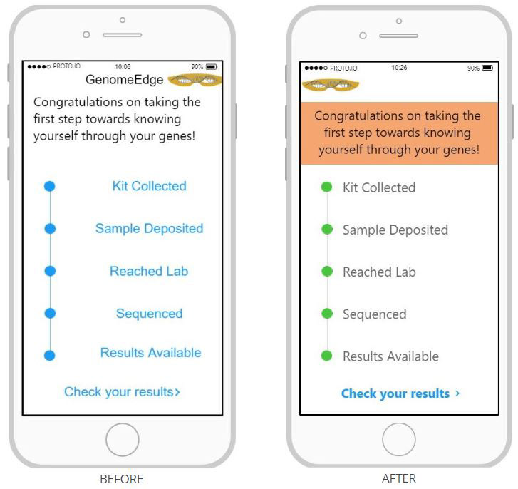
Test Timeline Screen - Typography color scheme was established to establish recognition of body text and clickable text.
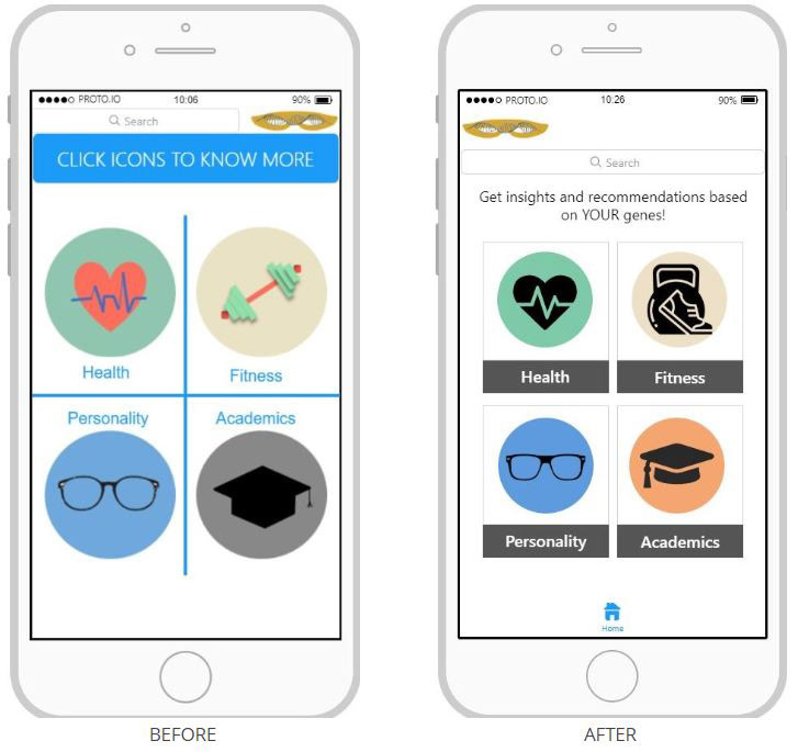
Insights Homepage Screen - “Click Icons to Know More” section was removed due to a possible misunderstanding of the section as being a call to action. Logo and Search Bar rearranged to allow for less cramped screen space and an increase of negative space. Insights were redesigned to be a cards style, which allows for a consistent aesthetic. Home tab navigation added to provide user control and freedom.
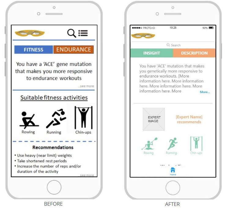
Insight Template Screen - The Insight Template Screen was iterated to make it possible for the developing team to “drop in” necessary data and information for each respective insight screen. Hierarchy was established with typography alterations -- for example, headers were given heavier weights than body text -- and the screen now features a familiar scrollable feed, instead of attempting to fit all information into one screen view.
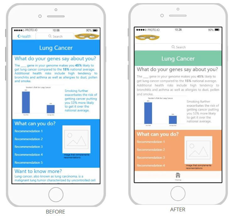
Lung Cancer Screen - Typography hierarchy and scrollable screen style applied to screen iterations to match consistency with other screen iterations.
While these before and after images feature beginning and final iterations of prioritized screens, they don’t feature the iterations that happened in between. A healthy cycle of design, analyze, collaborate, and redesign was what made this process successful.
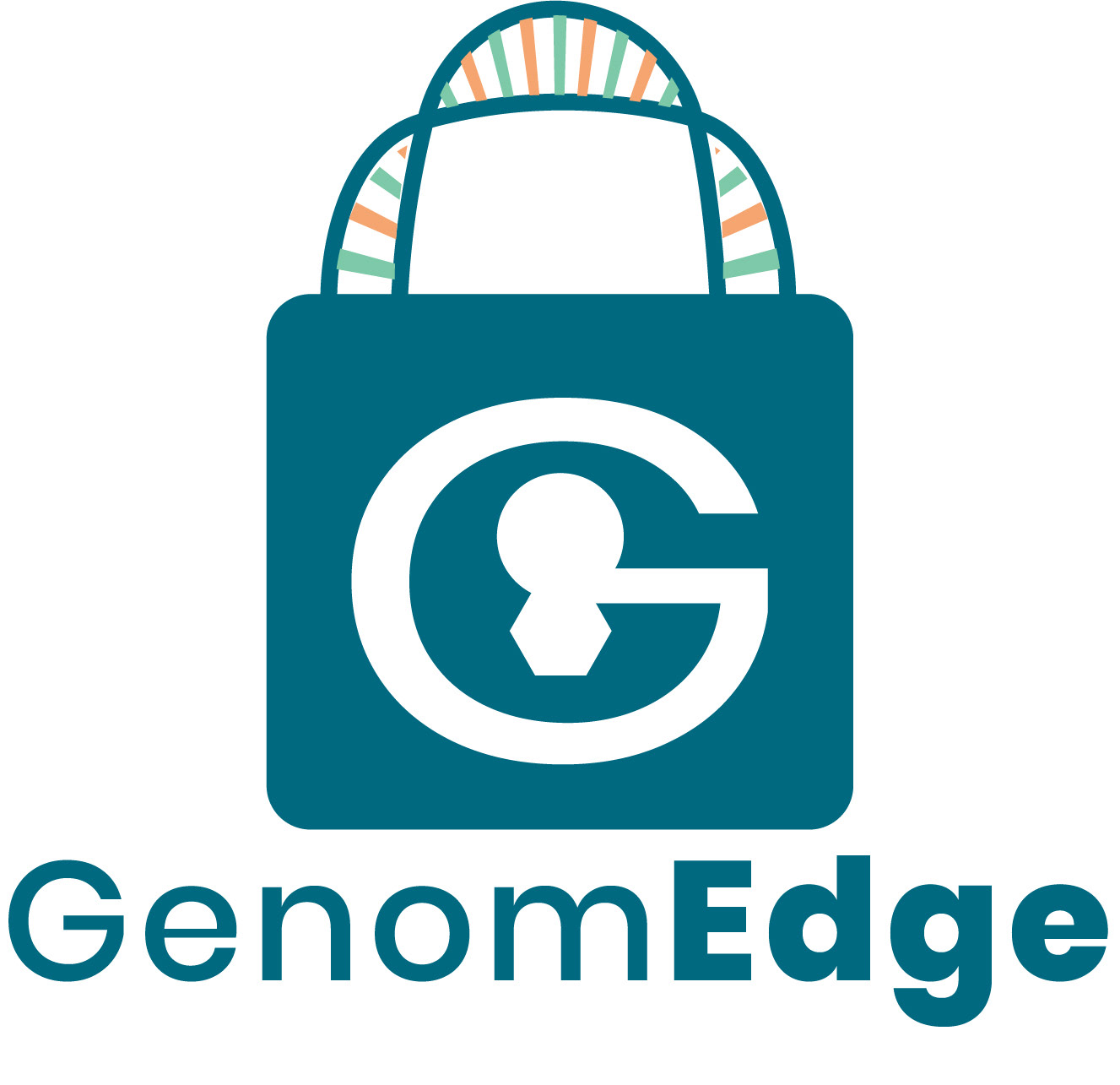
Logo Iterations
Possibly the most difficult step in this entire journey was tackling making iterations on the existing company logo.
While I love sketching creative logos on paper for countless hours, creating them digitally is something that I haven’t had the time to completely master yet. So, of course, this created a giant obstacle for me! However, after watching days of Adobe Illustrator tutorial videos for creating double-helix shapes, I was ready to dive in.
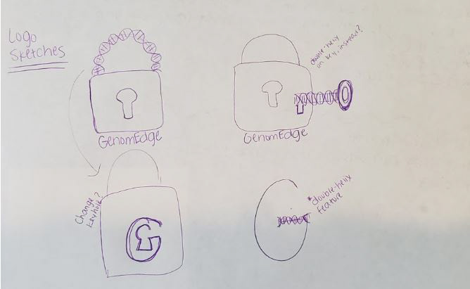
A few logo brainstorming sketches
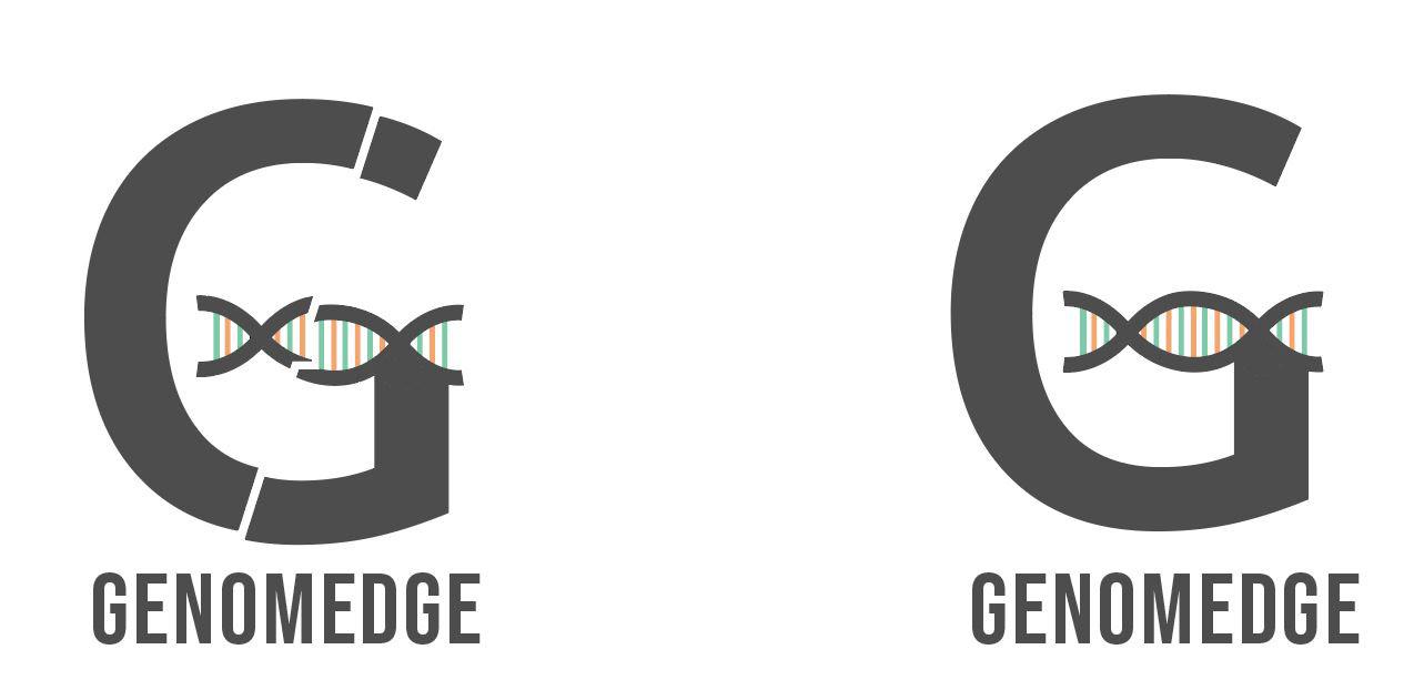
First logo iterations feature a simplified design incorporating the double-helix shape into the company’s G and showcasing colors from the app’s color scheme.
After collaborating with the CEO, it was mentioned that the G in my first iterations seemed to mimic the Google G. Also, the CEO voiced a desire that the logo should convey that the app can improve your life through their competitive, privacy-enhanced edge.

Second logo iterations feature a lock in an attempt to convey the privacy-enhanced edge that the company offers. This design uses the double-helix shape as the most vital piece of a lock.
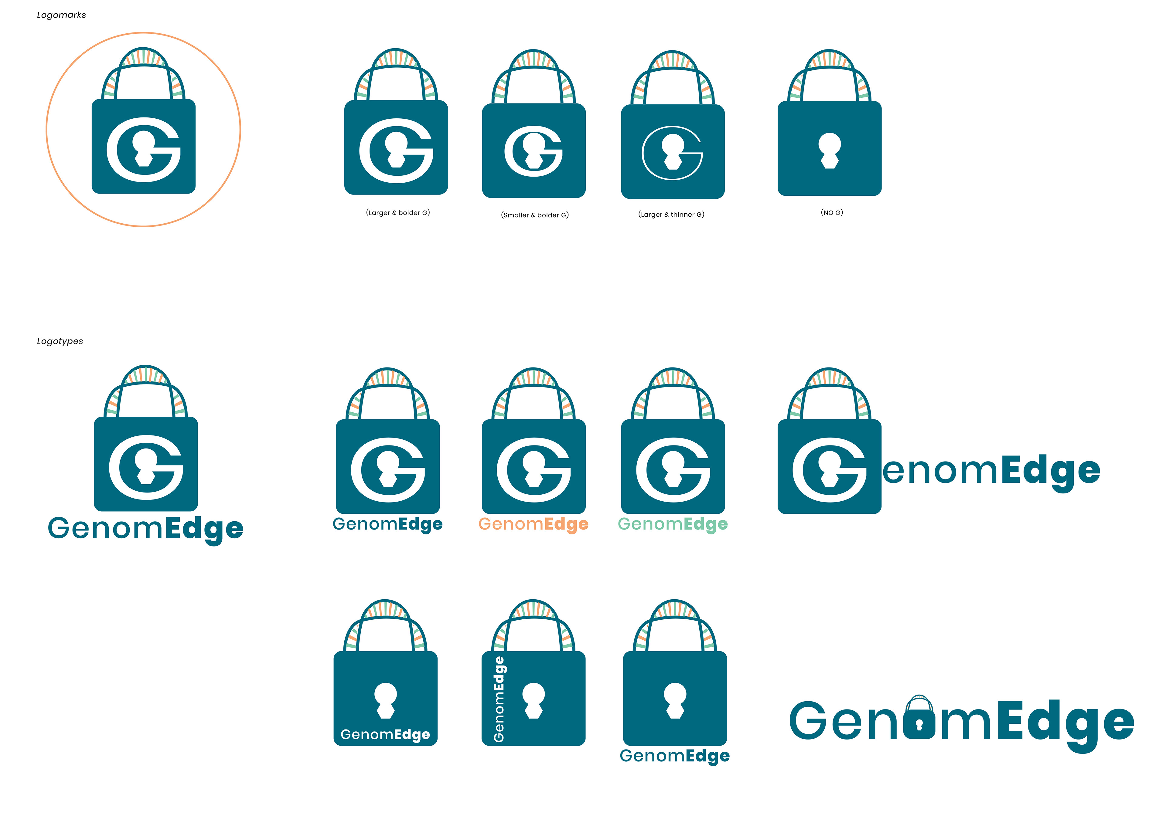
Final logo iterations showcase multiple styles of logomarks and logotypes of the lock design, keeping the double-helix shape as the eye-catching detail.
While the company is still uncertain of the direction they wish to take with the final logo design, I am assured that my designs have sparked possibility and creativity in the path they choose to take.
LESSONS LEARNED
This case study showcases the work of my 40-hour Industry Design Project with GenomEdge. I faced barriers of unfamiliar platforms, communicating across the country, and finding a balance between iterating on existing designs and including original ideas. I learned the power of collaboration as the foundation of successful design. Working on this project has been an amazing experience and I am so thankful to the GenomEdge team for taking me in, collaborating so eloquently, and being so incredible!
Want to learn more about this project or how I can help YOU with your next innovative project?