How would education improve if teachers had more time to teach?
THE PROBLEM
In the field of education, teachers are given high demands of keeping constant and professional communication with parents and families, but multiple platforms are being used to communicate and taking time away from teaching.
THE SOLUTION
My challenge was to create an all-inclusive app that eliminates the burden of using multiple platforms for communication and increases family involvement in classroom happenings through a user-centered design approach to reduce uncertainty. This version is intended to be from the perspective of a teacher as the user.
MY ROLE
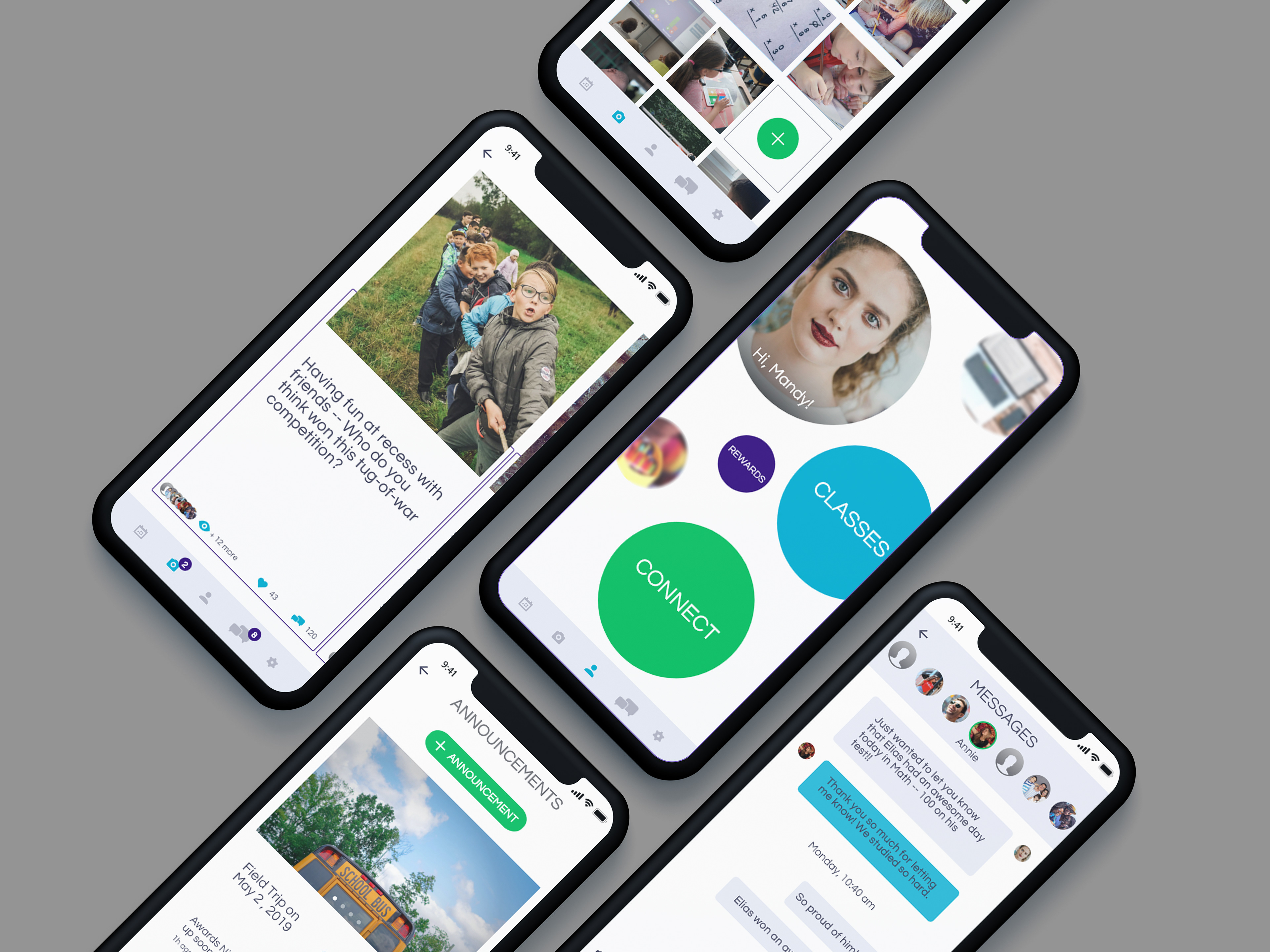
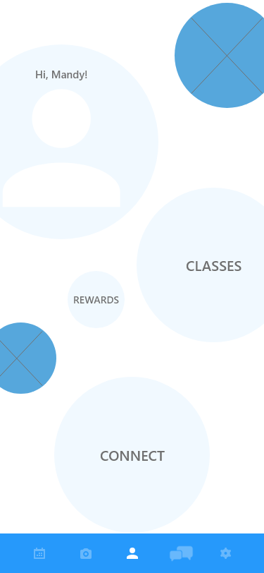
My role was to undertake user research to kick-off early ideation. Then, I worked extensively on user research and evaluation to design a prototype of an app that would be tailored to address user pain points. Loop-E app is a communication app designed for teachers to connect with parents and families of students.
USER RESEARCH
I conducted a screener survey with 20 participants and interviewed 5 who fit into my user group. The potential users, in this case, were full-time teachers. The purpose of this research was to get a better understanding of the fundamental issues of parent-teacher communication.
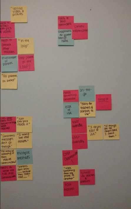
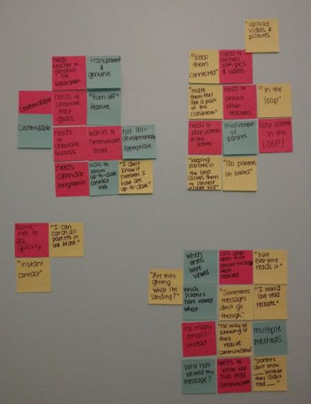
Through affinity mapping, I grouped their feedback into categories and discovered several commonalities.
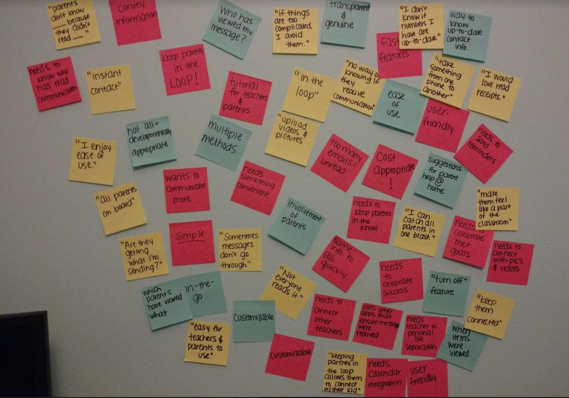
Click each image to zoom in.
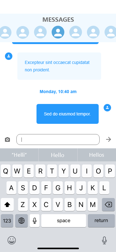
One of the key findings from my research was that 100% of interviewees expressed lack of read-receipts as a major pain point. This information led me to incorporate read-receipts and other visibility of system status elements in the app.
Another useful piece of information is that 100% of teachers mentioned that “keeping parents in the loop” allows them to connect with their child at home. These statistics confirmed to me that communication, although demanding, is a vital piece of education.
A critical pain point of product usage among these teachers is beautifully expressed by one quote that sticks out from the interview: “I want everything that I need in one central place because teaching is so fast-paced. I need something that’s convenient, and I don’t like having to use 10 different apps to achieve one goal.”
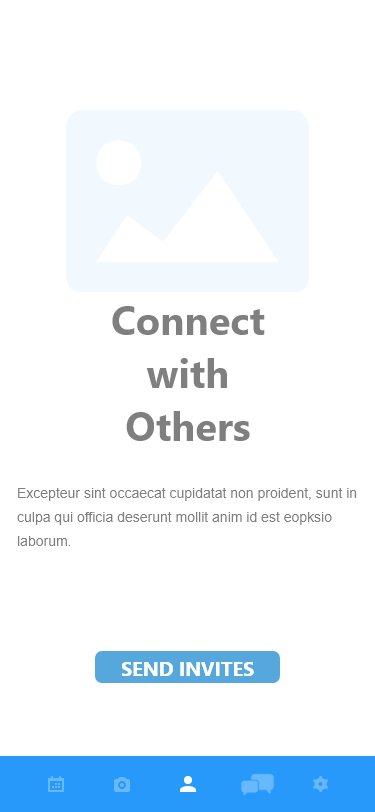
Another layer of consideration is that 80% of teachers noted the need to celebrate success. This prompted me to include a classroom feed of uploaded pictures and videos for visual celebration posts.
The need for an app that would help teachers maximize their time, centralize their needs and assure them that their communication is being received is vital.
COMPETITIVE ANALYSIS
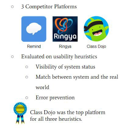
I identified three competitor mobile applications to my product idea: Remind, Ringya, and Class Dojo. The journey from messaging format to teacher-parent interactions was analyzed on these competitor platforms in order to uncover the successes and failures of each app. Each app was evaluated on the basis of three usability heuristics of the Nielsen Norman Group’s 10 Heuristic Principles: visibility of system status, match between system and the real world, and error prevention. I chose to focus on these three principles because my mission is to make my app SIMPLE. INVITING. TRUSTWORTHY.
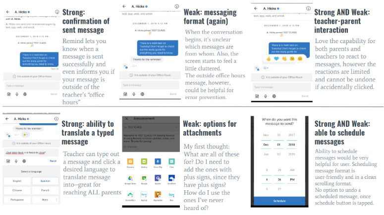
Analysis of Remind App
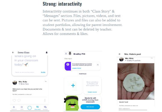
Analysis of Class Dojo App
Analysis of Class Dojo App
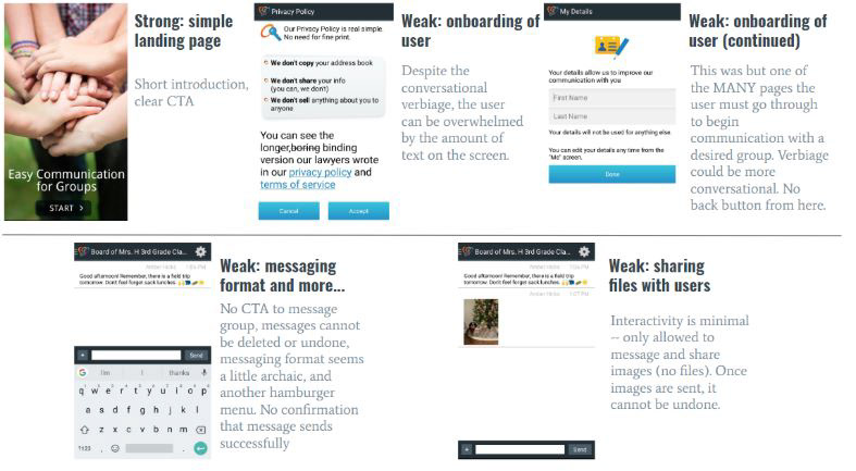
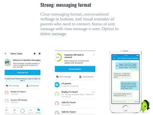
Analysis of RingYa App
Click each image to zoom in.
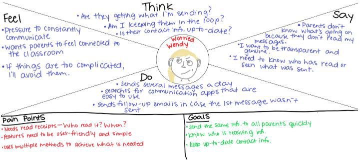
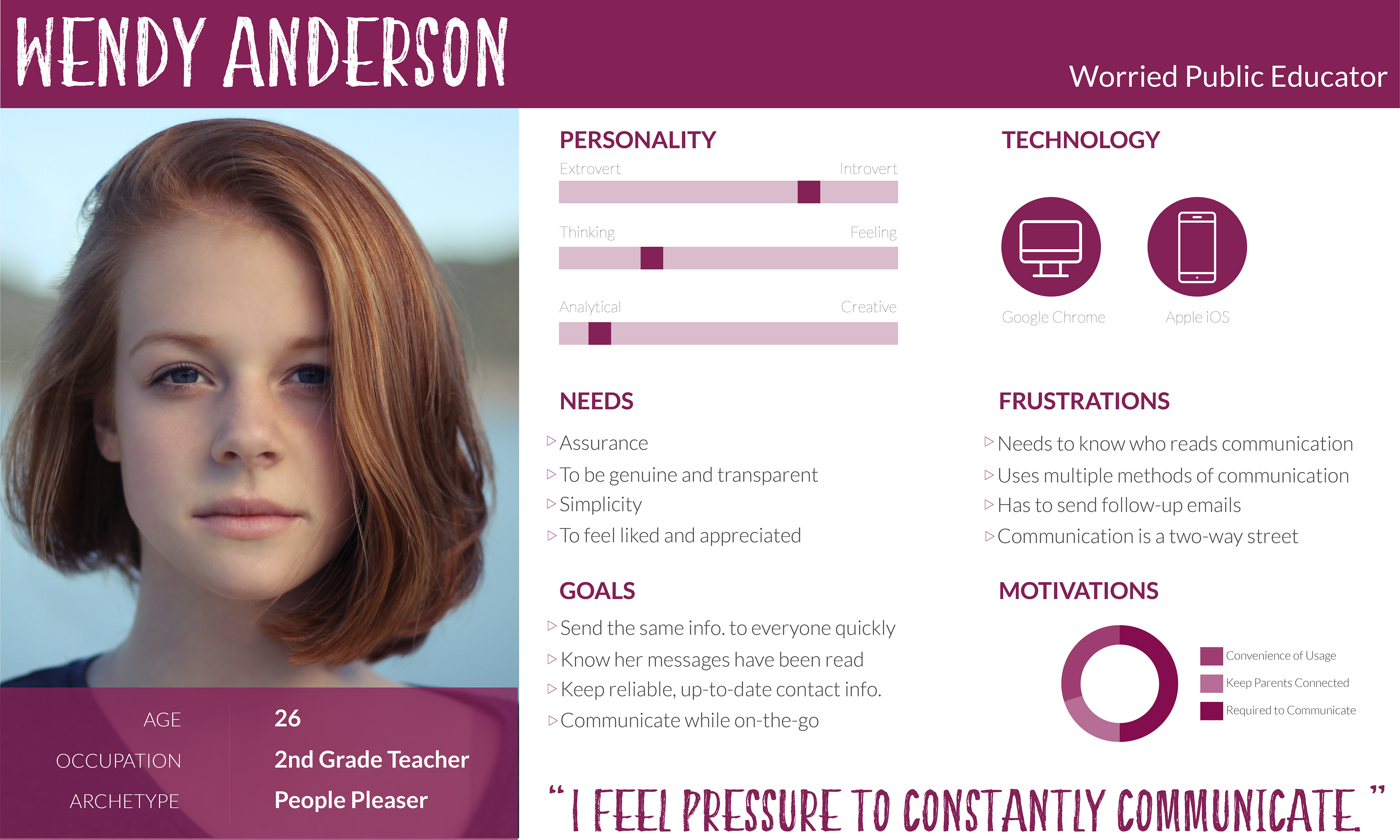
EMPATHY MAPS & PERSONAS
In order to gain a deeper understanding of my users, I created a persona using the information I gathered during interviews. Although the persona is depicted as a single person, Wendy Anderson, she was created by combining the characteristics and behaviors of many people.
To help bridge the gap between the persona and my design concepts, I also developed an empathy map to consider what and how my potential user is thinking and feeling.
Click each image to zoom in.
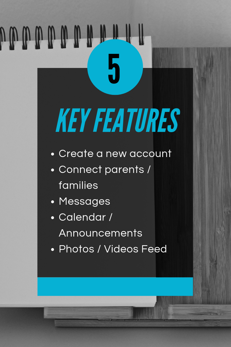
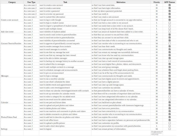
USER STORIES & MVP
Embracing the Lean UX process, my next step was to create an MVP (Minimum Viable Product).
What did my users want from this mobile app and why?
Five key features were selected for my product in order to satisfy my users’ needs and provide valuable feedback.
I listed my ideas as user stories -- as a _____, I want to _____, so that I can _____. This condensed the path to an MVP.
Cutting some of the “frilly” features, like customizable settings and a rewards shop, wouldn’t compromise the experience. They would benefit the product later on for shareability and conversion, but for now, the core experiences would be kept for an excellent proof of concept.
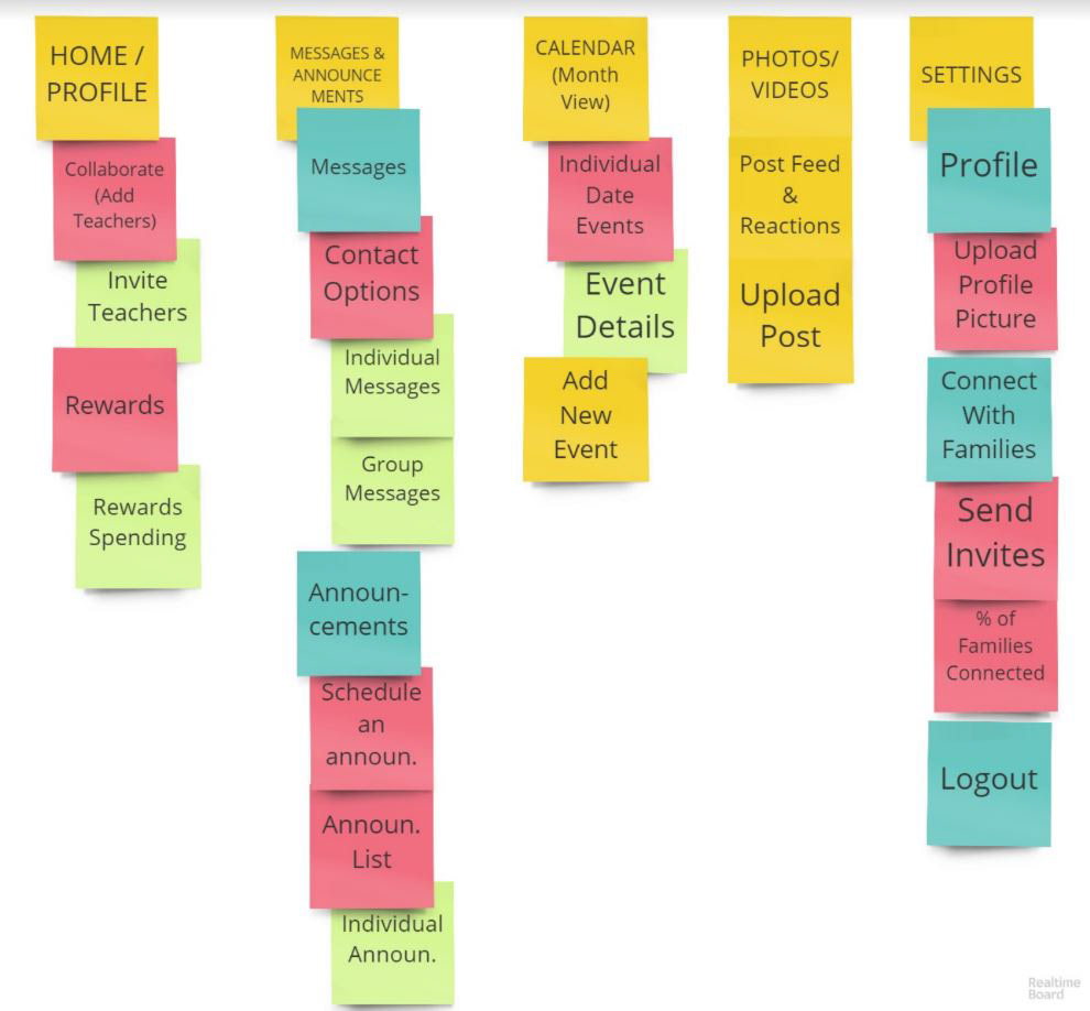
SITE MAPS
Thinking in terms of objects before actions (OOUX methodology) is central to my design framework.
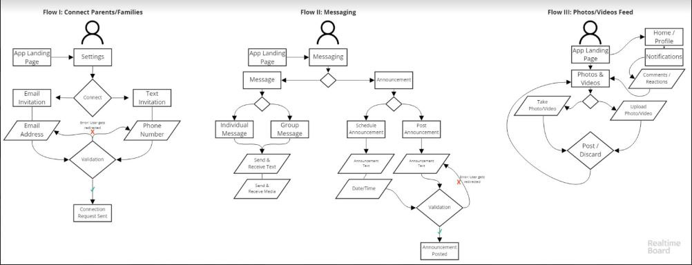
USER FLOWS
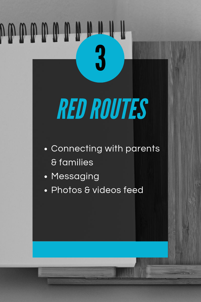
At this point, I was eager to jump into perfecting the pixels, but first I needed to give some thought to the structure and flow of the screens. Taking the time to consider my user’s objectives before I began the visual design process was challenging, but ultimately helped me design a better product and more meaningful user experiences. Three red route user flows were created to map the app’s critical routes.
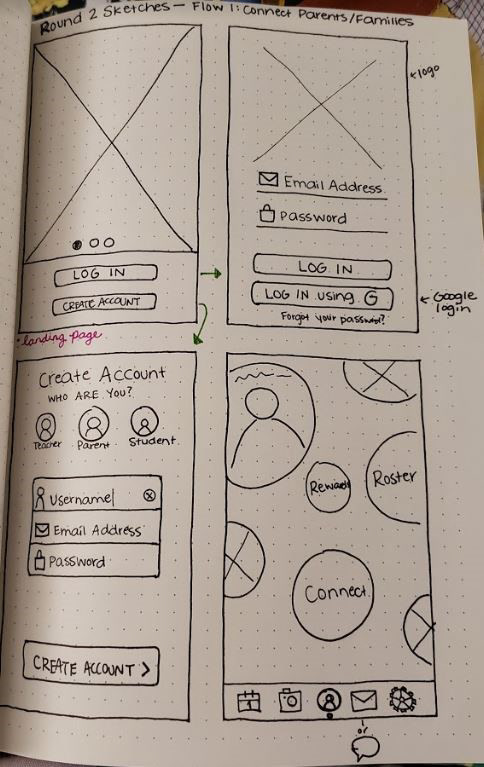
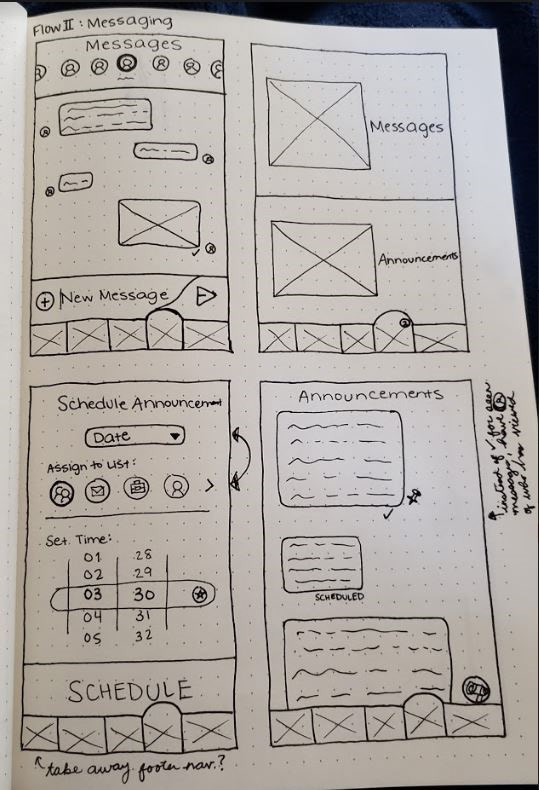
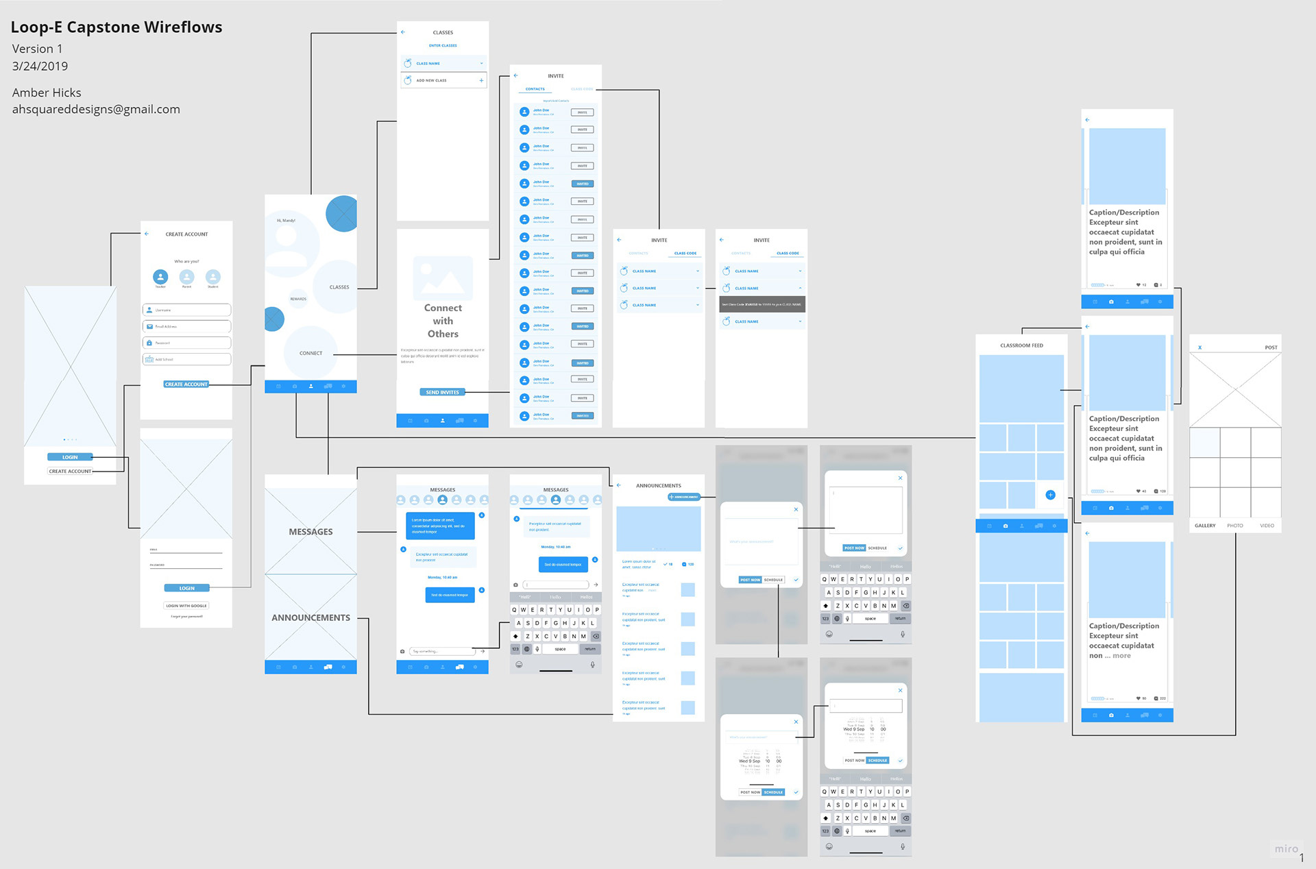
WIREFRAME SKETCHES
This was it! The opportunity to make it come to life -- sketching ideas for the design of my app, which I was now calling Loop-E, because interviewed teachers kept mentioning “keeping parents in the loop” and because E stood for education.
Using dot grid paper and flair pens, I created detailed sketches of my user interface. Sketching on paper eliminated any temptation to tinker with typefaces, colors, or graphics. My main focus at this stage was on optimizing the navigation and defining the basic hierarchy of elements for each page.
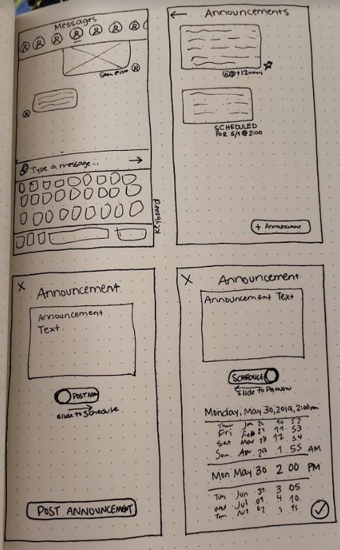
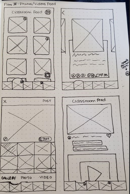
Click each image to zoom in.
GUERILLA USABILITY TESTING
Next, I created digital lo-fi wireframes from my sketches using Adobe XD. I uploaded these screens to InVision to create a clickable prototype. Wireframes guided the wayfinding in the app.


Click each image to zoom in.
I made the decision to test Loop-E as a lo-fi wireframe because if the interface doesn’t work in lo-fi, pretty colors and typography cannot save it.
Five usability tests were held at Jefferson Academy, a 3rd through 5th grade public school. Going into testing, I had a hypothesis that some of my screen interactions might be tricky to fully comprehend in lo-fi. This prediction proved to be correct as several users verbalized questions when viewing the messaging and scheduling announcements screens.
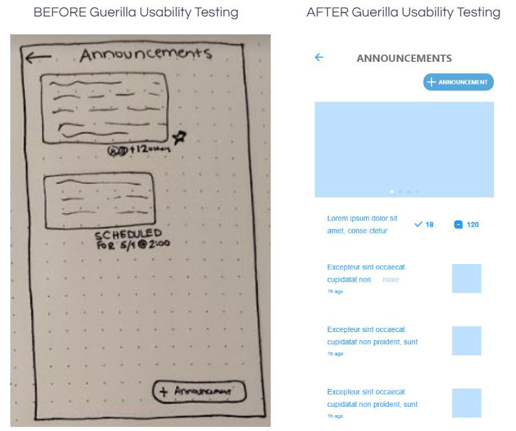
Overall, usability testing was a success and I was able to identify two issues that could be improved in the next iteration. Improvements made as a direct result of the usability testing include: the layout of the Announcements screen and the consistency of button placement.
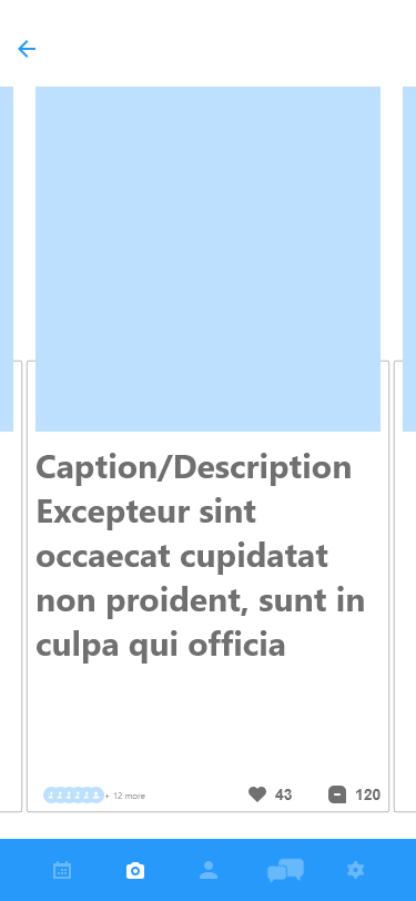
The original layout of the Announcements screen was apparently not as successful as I had thought, and 100% of users expressed the desire of a more social media-like feel to the screen. Iterations make this screen scrollable, give it a more recognizable layout and reflect the capability for teachers to obtain viewer status and comments on announcement posts. This change makes the screen intuitive and familiar.
Several buttons were not consistently placed across the app, making it difficult for users to navigate multiple screens. Iterating on this UI inconsistency issue early on will provide for a higher task-completion rate in high-fidelity screen designs.
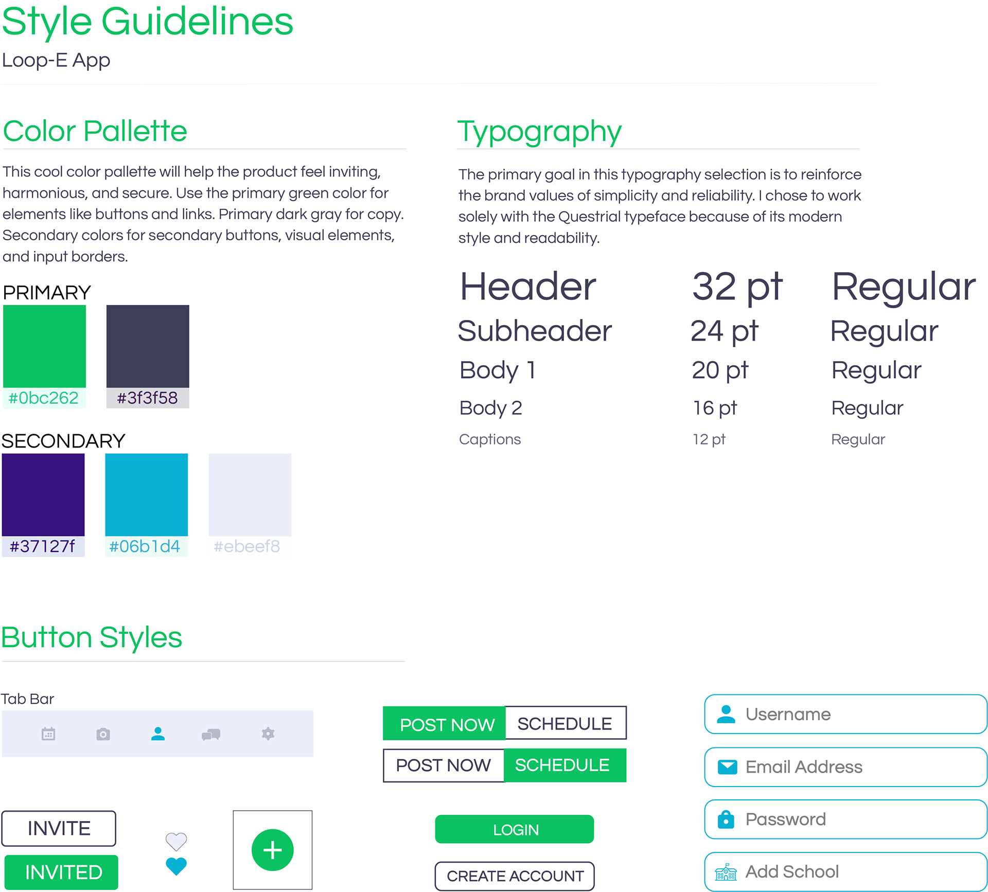
VISUAL DESIGN
The 3 main feelings central to my design decisions in the creation of Loop-E.
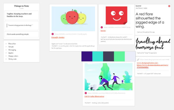
A mood board was produced using Milanote to showcase the approach for a simplistic, inviting, and calm feel. Familiar educational icons, such as apples and sticky notes, convey recognizable and trustworthy symbols.
Style guidelines connect to solving my user’s problem by giving the app clean readability, consistency of color scheme in buttons and screen copy, and establishing typography hierarchy. Bright, cool colors provide a playful and inviting aesthetic as the app is used primarily in classrooms. Lighter backgrounds with darker text on screens provide a less obtrusive design, as this app will be used in bright environments such as the classroom or on field trips.
HIGH-FIDELITY PROTOTYPE & USABILITY TESTING
All of the design aspects mentioned played a vital role in the creation of Loop-E. Adobe XD was used to create screens and to prototype the red route user flows. Illustrator and Photoshop were used in the creation of some screen components.
Two rounds of usability testing were conducted at Jefferson City Schools.

First-round usability testing was conducted with 5 teachers following the usability test script. This round of testing provided me with important feedback that would be crucial to imperative iterations. All users expressed that the placement of the announcements section was not where they thought it would be, proving that I needed to rethink the informational architecture and wayfinding of that content. Another layer of consideration that was revealed was that all users desired to see more interactivity in text fills in the messaging and announcements tasks. Iterating on this provides the users with a better sense of fulfillment.
After iterating based on first-round findings, second-round usability tests were conducted with 5 new teachers. This round of testing proved that iterations were beneficial as there was a 100% task completion rate. User reactions did uncover new pain points such as needing a back arrow out of the messaging section for increased UI consistency. This serves as a perfect reminder that a product can always be iterated upon to improve user experiences.
LOOP-E PROTOTYPE
LESSONS LEARNED
This case study was part of my capstone project for the Springboard UX Design Career Track Course. Working on this project has been an amazing experience and I’ve learned so much throughout each stage of the design process. I faced barriers of unconscious bias, feature creep, and desiring every pixel to be perfect. I learned the power of research as the foundation of quality design. If given the opportunity, I would continue to iterate on Loop-E based on what my users recommended from second-round usability testing. I would also love to show the app from the perspective of a parent as a user. With that, consider this project to be continued...
Want to learn more about Loop-E or how I can help you with your next innovative project?