OVERVIEW
CityPups is a new startup wanting a product to help people living in cities find the perfect dog to adopt.

THE PROBLEM
People living in cities struggle to find the right dog to adopt due to their unique needs: living spaces, schedule and transportation, outdoor space, and other city-specific criteria.
THE SOLUTION
A CityPups website will meet the startup’s goal of increasing the adoption rate, having happier owners, and connecting dogs with better “forever” homes.
MY ROLE
Through this 5 day modified GV design sprint, I synthesized provided research to sketch and design a prototype, which underwent 5 usability tests.
CUSTOMER INTERVIEWS
In order to obtain user data, interviews and surveys were conducted and provided in the BitesizeUX challenge.
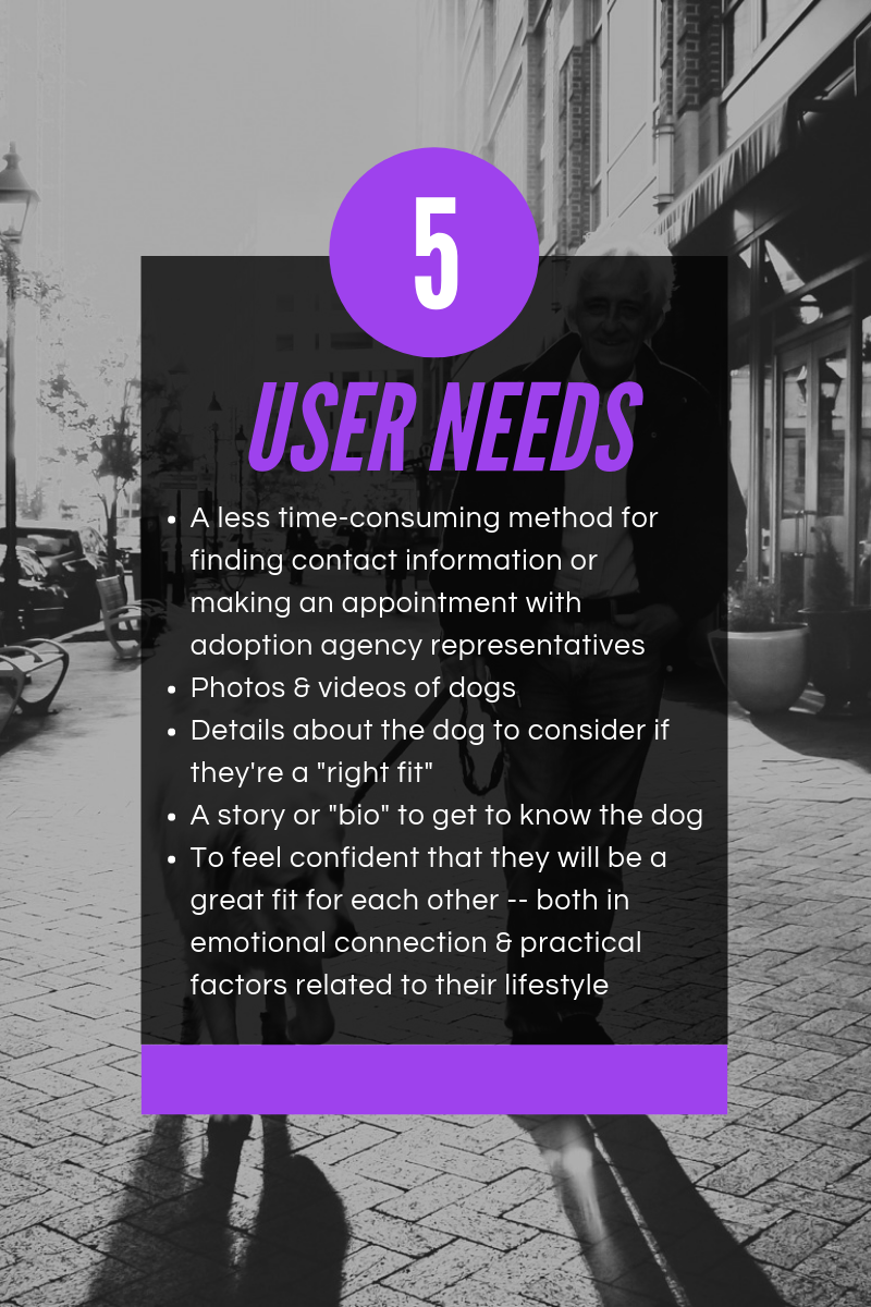
Through surveys and interviews, it is evident that users need the following:
GETTING STARTED
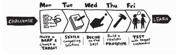
DAY 1: UNDERSTANDING & MAPPING
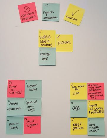
Based on research data provided, I created an affinity map to cluster data into categories. This helped me see a trend of noted needs and pain points.
Then, I drafted a possible end-to-end experience a user might have with the CityPups website.
DAY 2: SKETCHING
Lightning demos were conducted on several websites.
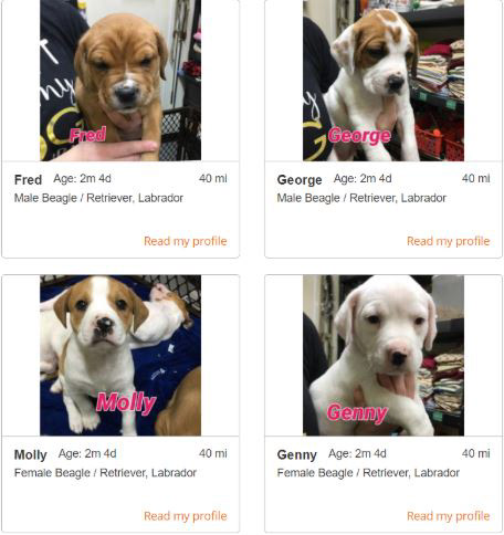
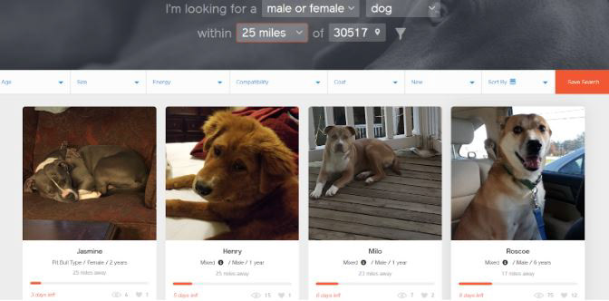
The Petango website provided a photo grid layout that I wanted to experiment with in my website design. I liked the consistency, simplicity, and that users can immediately see a picture with some details about a puppy that they might be interested in. However, there are several features that I would improve on this website: a more modern UI, higher image quality, and other vital visual components.
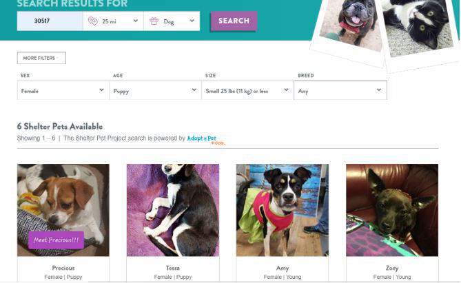
I was inspired by several components of The Shelter Pet Project’s website. The cool colors were inviting and attractive. I also loved the ability to filter search options by sex, age, size, and breed of dog. I wanted to incorporate similar filter capabilities in my website design.
Get Your Pet’s website had a modern feel with proximity filters, which I determined would be a perfect feature to implement in my website design, since users might not have appropriate transportation means for meeting and adopting their dog. When viewing more information about a dog, details were displayed in an understandable format and users are able to view a location map.
Crazy 8s Exercise
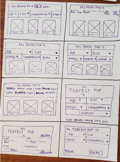
I selected the filtering process as my critical screen because research heavily highlighted falling in love with a dog that wasn’t the right fit as one of the biggest pain points. 100% of users mentioned some quality that they search for in their “perfect fit.” One quote that stood out was from Ron: “I end up falling in love with a little dog that really needs more space to live and play than I can offer.” Comparatively, Ellie mentions that she “falls in love with dogs (when seeing their pictures) that need more space, attention, or activity than I can provide. That leaves me feeling disappointed and indecisive.”
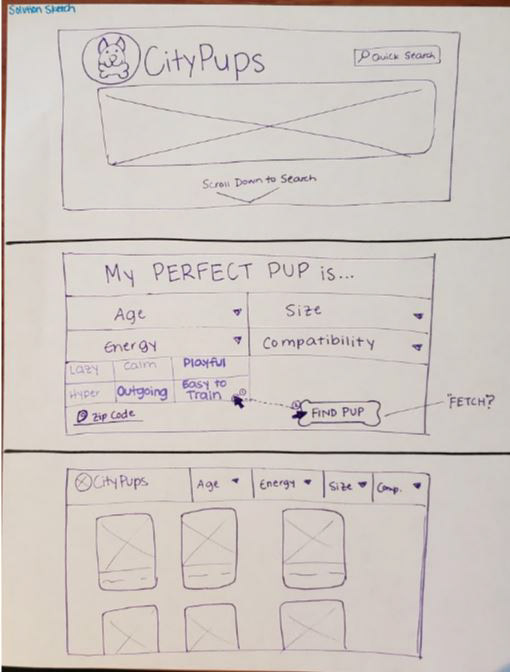
Solution Sketch
DAY 3: STORYBOARD
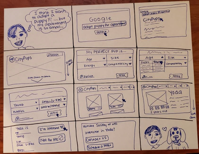
I created a storyboard from the moment my user decided she wanted to adopt a puppy but had hesitations due to living in a small apartment. Her goal is to find the right dog to adopt and to feel confident that they will be a great fit for each other -- both in emotional connection and practical factors related to her lifestyle. Being able to filter qualities before seeing pictures of dogs eliminates the pain point of falling in love with a dog that needs more space, attention, or activity than she can provide -- ultimately leading the user to a third-party website to complete the adoption process and bring home her new best friend.
DAY 4: PROTOTYPE

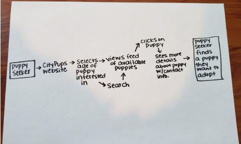
Focusing on the filter qualities to allow my user to connect with the “perfect fit” drove my design decisions in the prototyping process. Using my storyboard, I created the screens I sketched. The prototype takes the user from the landing page, through the process of finding a dog to adopt, and finally arrives at being interested in adopting Yoda. The “INTERESTED” CTA directs the user to a third-party adoption site.
This step was a barrier for me, as I frequently found myself wanting to design more of the website than what was involved in the critical route. I had to force myself to design much faster than usual -- that was very challenging, but also very rewarding. I have learned that designing quickly can help me be creative on a whim and less distracted by every pixel.
My goals for testing the prototype were to validate the efficiency of the critical route flow and to gain initial feedback on the basic UI elements of the website. I hoped to learn if the flow was simplistic enough or if the process needs to be iterated upon.
DAY 5: INTERVIEWS
Five users were interviewed using the designed CityPups Prototype. These five users currently do not own dogs but have thought about adopting a dog before.
Participants were interviewed using the 5 Act Interview process and given a task to adopt a young dog using the CityPups Prototype. Asking open-ended questions and prompting participants to verbalize their thoughts were two extremely essential steps in gaining constructive feedback.
Testing produced several patterns: 100% of users mentioned that the website was easy to use, that the option to filter several qualities makes the website beneficial and that the pictures of dogs are in an organized layout. 100% of users successfully completed the task of adopting a dog, which proves that the flow is simplistic and efficient.
Another layer of consideration from interviews was to include additional filter options such as gender and breed, to reword the “Compatibility” filter verbiage, and to carry over the chosen filtered selections to the feed of searched dogs. If given the time, I would iterate the website to include these features in order to make the task more user-friendly and to increase the word clarity.
Want to learn more about CityPups or how I can help you with your next innovative project?